Period and heritage homes are among London’s most cherished architectural treasures. From refined Georgian townhouses and ornate Victorian terraces to elegant Edwardian villas
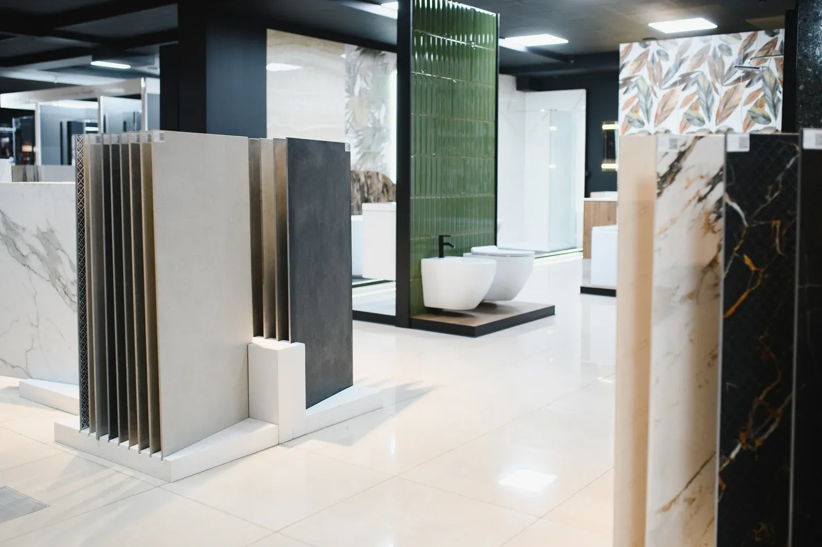
Keeping a retail space vibrant and inviting is crucial for attracting customers and driving sales. Seasonal shop makeovers offer a fresh, visually appealing environment that reflects current trends, holidays
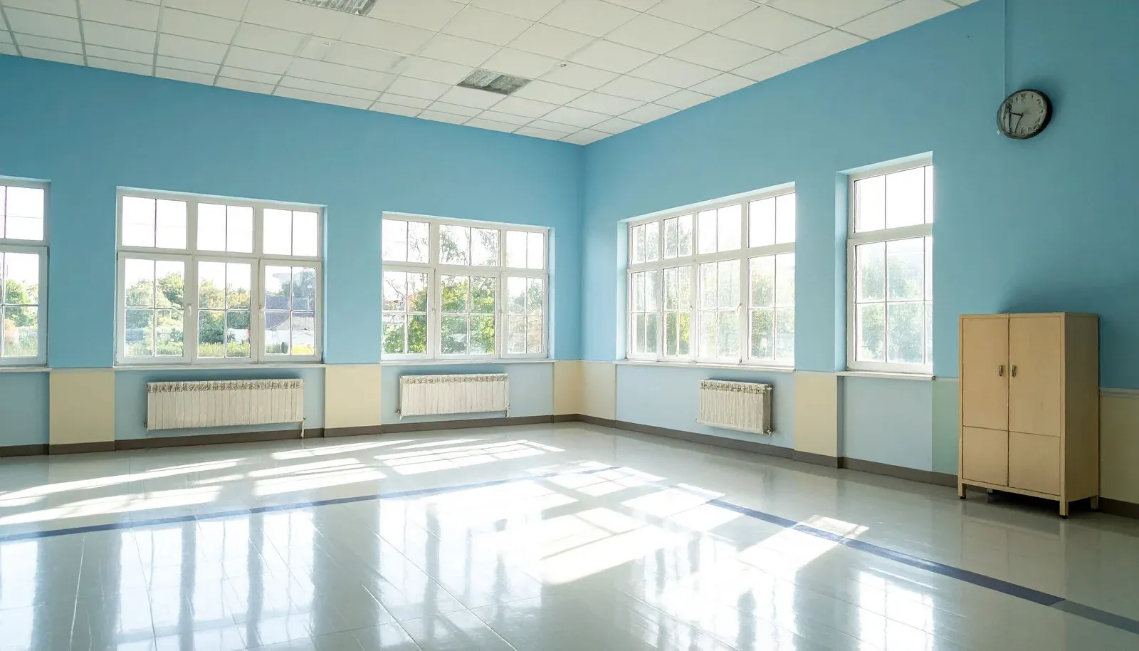
The environment in which students learn can have a profound impact on their engagement, focus, and creativity. While traditional classrooms often rely on neutral tones