Colour Psychology in Interior Design: Set the Mood with Decorwise
aiman.fauarsy • June 2, 2025
Selecting the right colours for your home or commercial space is a crucial part of the interior design process. Colours have a significant impact on the overall ambiance and mood of a room, which directly affects the emotions and well-being of its occupants. With over 30 years of experience providing residential and commercial painting and decorating services in London, we understand the importance of harnessing the power of colour psychology for creating a harmonious, comfortable, and visually appealing environment.
Colour psychology is the study of the emotional and mental responses triggered by different colours. In interior design, understanding colour psychology can be invaluable in helping you select the most suitable shades for your space. This knowledge empowers you to create a room that evokes desired feelings, from serenity and relaxation to stimulation and productivity.
In this article, we’ll delve into the fascinating world of colour psychology and explore how different colours can influence the atmosphere in any space. We’ll also provide practical tips and insights on choosing the perfect hues based on the function of the room, lighting conditions, and your personal style preferences.
Whether you’re looking to create a tranquil oasis in your bedroom, a cozy haven in your living room, or a motivating workspace, understanding colour psychology can help you make the right decisions to achieve the ambiance you desire. So, let’s dive into this captivating subject and learn how to harness the power of colours in your home or commercial space. Turn to Decorwise Painters and Decorators London for expert guidance on how to make the most of colour psychology principles in your interior design journey.
Understanding the Emotions Behind Colours
Before diving into colour selection for your space, it’s crucial to understand the emotional impact that different colours can have. Generally, colours can be classified into two main categories: warm and cool. Warm colours, such as red, orange, and yellow, tend to evoke feelings of warmth, energy, and excitement. In contrast, cool colours, like blue, green, and purple, are associated with calmness, relaxation, and introspection.
Beyond these general categorisations, specific colours also have unique connotations and effects:
- Red: Passion, energy, and intensity
- Orange: Warmth, happiness, and enthusiasm
- Yellow: Optimism, cheerfulness, and clarity
- Green: Balance, tranquillity, and growth
- Blue: Trust, loyalty, and serenity
- Purple: Majesty, creativity, and spirituality
- White: Purity, simplicity, and openness
- Black: Power, sophistication, and depth
Armed with this knowledge, you can better understand the potential impact of colour choices on your space’s atmosphere and tailor your selections to evoke the desired emotional response.
Selecting the Right Colour Palette for Your Space
Once you have a grasp on colour psychology, the next step is to choose the most appropriate colours based on your room’s primary function and your personal preferences. Here are a few general guidelines to consider when selecting colours for different rooms:
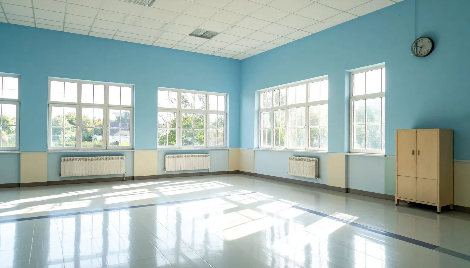
Bedrooms: Choose soothing colours, like pale blues or soft greys, to promote relaxation and restful sleep.
Living rooms: Opt for warm and inviting shades, such as earthy browns or muted yellows, to create a comfortable and social atmosphere.
Kitchens: Select energising colours, like bright reds or zesty oranges, to stimulate creativity and conversation during meal preparation.
Home offices: Go for calming blues or greens to instil focus and productivity while minimising stress.
Remember that these are merely suggestions, and the ideal colour palette for your space ultimately depends on your tastes, personality, and unique requirements.
Creating Cohesion with Colour Schemes
A harmonious colour scheme is essential for a well-designed space. When selecting your palette, consider using either complementary or analogous colours to ensure visual balance and unity. Complementary colours are opposites on the colour wheel and create striking contrasts (such as blue and orange), whereas analogous colours are those adjacent to one another and promote a more seamless, flowing transition (like blue, green and yellow).
In addition to keeping colour scheme principles in mind, consider the 60-30-10 rule for a balanced and visually appealing space. This guideline suggests that your primary colour should cover 60% of the room (walls), the secondary colour should account for 30% (furniture and upholstery), and the tertiary, accent colour should comprise the remaining 10% (accessories and accents).
Considering the Effects of Lighting on Colours
Lighting plays a crucial role in how colours are perceived in a space. Natural light, artificial light, and the direction of light can all alter the appearance of colours on walls and furniture. Test paint samples under various lighting conditions before committing to any shade to ensure you are satisfied with how it looks throughout the day and night.
Moreover, be aware that rooms with ample natural light can handle darker, bolder colours, while spaces with limited light are better suited to lighter, brighter shades to make them feel more open and airy.
The Transformative Power of Colour Psychology in Interior Design
By understanding and incorporating colour psychology principles into your interior design choices, you can curate a space that not only looks stunning but also evokes the desired emotions and ambiance. Whether you prefer a relaxing haven, an energising sanctuary, or a nurturing environment, the power of colour can genuinely transform your space.
Remember to consider the emotional impact of colours, choose appropriate hues based on function and preference, create harmonious colour schemes, and evaluate the effects of lighting on your palette. With these guidelines in mind, you’ll be well-equipped to make the best colour choices for your home or commercial space, resulting in a visually engaging and emotionally satisfying environment.
For expert guidance and assistance in utilising colour psychology to transform your spaces, contact Decorwise Painters and Decorators London, London decorators with over 30 years of experience. Together, we can create the perfect palette to bring your vision to life and establish an exquisite atmosphere in your space.